Interlocked, Intertwined, Interesting.
I've been fascinated by letterforms of all kinds, especially sports letterforms, for as long as I can remember. While sports uniform lettering is undoubtably a great and worthy thing, intertwined letterforms hold special appeal for me. There's an art to conveying a powerful message via a minimal number of elements, and a real challenge in creating a readable piece of art without the benefit of iconography. Take two letters, place them atop one another, then start to move them around. Too much noodling and legibility can easily give way to hieroglyphics.
Think of interlocking sports letters and several prominent examples immediately spring to mind—baseball's New York Yankees and St. Louis Cardinals, Notre Dame and the University of North Carolina from the college ranks, for instance. For some reason, basketball has never done this well. Nor has hockey—with the very notable exception of the Montréal Canadiens' classic crest. Football has a few examples to be sure, but helmet designs were, for the most part, a product of the early 1960s, an era when consumers demanded iconography and a break from tradition.
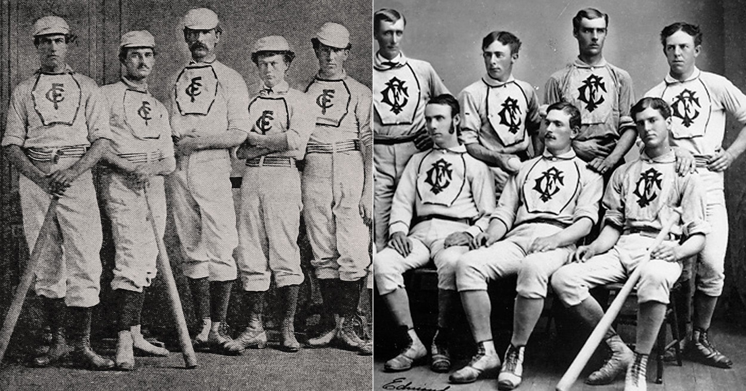
Decorative elements on baseball uniforms, including interlocked letters, flourished in the years immediately following the Civil War. The Rockford (Illinois) and Cleveland Forest City clubs both wore interlocking "FC" insignias (Rockford is depicted at left, Cleveland at right.)
While baseball uniforms embraced a more austere visual sensibility in the 1880s and 1890s, the turn of the twentieth century witnessed the return of the interlocking logo in a big way. Several teams began to employ monograms at this time, including the St Louis Cardinals and Browns, each with competing "STLs." In 1908, the Pittsburgh Pirates started wearing a "PBC" (Pittsburgh Baseball Club) emblem on their uniform sleeves. It should be noted that some letters just don't interact well together to form elegant and readable combinations—three intertwined letters is a tough thing to pull off. The Bucs did an outstanding job.
The New York Yankees cribbed their now famous interlocking "NY" from a New York City Police medal of valor that was designed by the studios of Louis C. Tiffany in 1877, more than two decades prior to the Bombers' first usage. The Yankees (or Highlanders, as they were then known,) used this interlocking "NY" in 1905—it lasted but a single season.
The New York Giants introduced their own interlocking "NY" in 1909. It evolved over the years, right up until the Giants' departure for San Francisco in 1958. The expansion New York Mets adopted it four years later and it still lives today, rendered in orange on a blue field, as opposed to black.
Even in the digital age Intertwined characters remain ever popular, and they continue to evolve. Inlines, multiple outlines, drop shadows, and implied dimension via the use of beveling have all served to push things forward, deep into the 21st century. Trends inevitably come and go, but the timeless appeal of interlocking logos remains. All hail the interlocking monogram, a visual staple of sports design and a much-loved touchstone for fans from coast to coast.


