ESPN Baseball Tonight Podcast's Top 30 All-Time MLB Logos
All throughout the 2017 baseball season I have been counting down the Top 30 logos in the history of Major League Baseball on the ESPN Baseball Tonight podcast (click here for a full inventory of podcasts.) My criteria was based on several guiding principles, including the fact that multiple “top logos” would potentially be assigned to particular clubs, which meant that not every franchise would make the Top 30 cut. Note that we are talking primary logos, cap logos, or sleeve patches, as opposed to uniform lettering (so the St Louis Cardinals' "birds on bat" are not included here.) The Top 30 is bound together by the fact that they are all memorable (in a good way) and that any association with great championship teams represents a big plus. Great pieces of design are appreciated, and they all come from within the span of our collective memories, so no 1915 Phillies here either. An interesting story behind a particular logo might also help to vault it onto my list. Finally, intentionally wishing to avoid all conflicts of interest I have excluded anything I have ever worked on. This is an eclectic and lively mix, which pays tribute to a range of franchises. That said, here is the complete list, starting at the top:
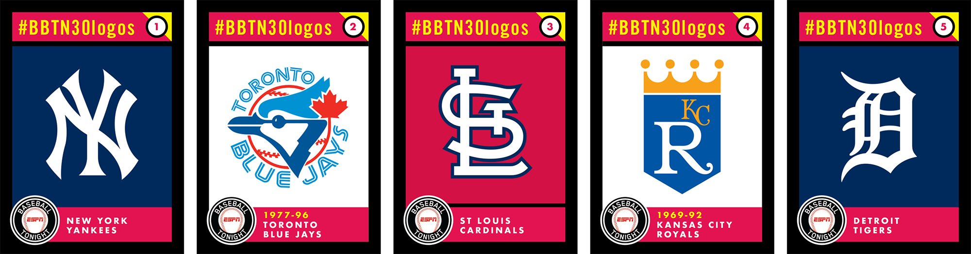
1) New York Yankees interlocking NY logo
What vaults this iconic trademark to the very top of our list, above every other logo in MLB history? Let’s start with the fact that it’s one of the most recognizable symbols in the world. Travel the globe and you’ll see people wearing caps with this logo—I myself have seen it worn in places as far flung as Cuba, Estonia, and Slovakia. It’s ubiquitous, it’s a symbol of New York and of America, and it’s associated with celebrity and fame.
Now let’s get to the baseball part. The logo was first worn by the club in 1909, so it binds together each and every one of the Yankees’ record 27 World Series championship teams. It has borne witness to more than one third of all World Series games, and it was worn by a host of legendary players from Ruth to Gehrig to DiMaggio, right up to Jeter and Rivera.
There are several versions of the interlocking NY currently in play, including one for headwear and a different one on the home jerseys, but the NY is an aesthetic masterpiece—balanced, simple, tasteful, and timelessly fashionable.
The logo was designed in 1877 by Tiffany & Co. as part of a silver New York City Police Department Medal of Valor, and was adopted by the club several years before they were even officially called “Yankees.”
Is there some predictability in this choice? Perhaps. But all of the information that I just conveyed makes a very strong case—one man’s educated, subjective, opinionated opinion—but a solidly logical one.
2) Toronto Blue Jays primary logo 1977-96
Why does this merit such an elevated spot in our Top 30? For one thing, it’s a modern classic. It was created at a time when many of our sports logos were veering off into crazy and sometimes questionable directions, but the Jays’ original logo pulled off a particularly difficult feat with a memorable and classy look that is optically flawless. It’s simple, yet it does a lot with a little. It conveys the name of the team, the Canadian location of the team, and the sport of baseball, all with minimal effort. Every space within the mark is used to great effect, and the clubs’ two different blue colors are both proprietary and timeless.
It served the team well from its first game in 1977 right through to the Blue Jays’ back to back World Series championship clubs in 1992 and 1993 before being discarded a few years after. Forty years after it launched, the Blue Jays’ original look is echoed in its current look, a reverent update that has been embraced by their fan base with great affection.
As we approach the very top of our Top 30 all-time MLB logo list it’s important to pay homage to the modern era, and this one should score high points for traditionalists as well as those with more contemporary tastes.
3) St Louis Cardinals headwear STL logo
Why does this merit a spot in our Top 30? It’s a thing of beauty, balanced, well-proportioned, and distinctive. The interlocking STL complements the club’s signature "birds-on-bat" uniform graphics in seamless fashion. Aside from its pleasing optics, it’s associated with multiple championship teams, which helps elevate it to iconic status. Hall of Famers from Musial to Brock to Gibson to Ozzie Smith have all worn the STL, a franchise staple for generations.
4) Kansas City Royals primary logo 1969-92
Why does this merit a spot in our Top 30? It’s simple, recognizable, and elegant, and it has served as the core identity for the club for nearly a half century.
The original version of the logo featured a large “R,” for Royals, accompanied by a smaller “KC,” but the balance shifted in 2002. The logo was created by designer Shannon Manning and KC-based Hallmark. twenty one Hallmark artists took a shot at creating the logo, but Manning’s art won the day, which is a good thing. Among the rejected concepts was one that featured a psychedelic cow with a speech bubble that contained the name of the club.
The Royals’ crown logo has stood the test of time, a contemporary classic that has aged well and looks especially great twelve stories high, a very visible focal point at the Royals’ home, Kauffman Stadium.
5) Detroit Tigers Old English D
Why does this merit a spot in our Top 30? It’s an undisputed classic. Over the years, the’ "D" has come to represent Motown civic pride, a perpetual emblem for a resilient city and its people.
The Old English "D" is MLB’s oldest visual icon, connecting Tigers legends from Cobb to Greenberg to Kaline to Cabrera. In fact, it even predates the Tigers’ status as a major league franchise.
120 years after its debut, the "D" both endures and thrives as one of the most identifiable insignias in American professional sports. The phrase “Old English D” first appeared in print in the March 13, 1896 edition of the Detroit Free Press, and it has been known as such pretty much ever since.
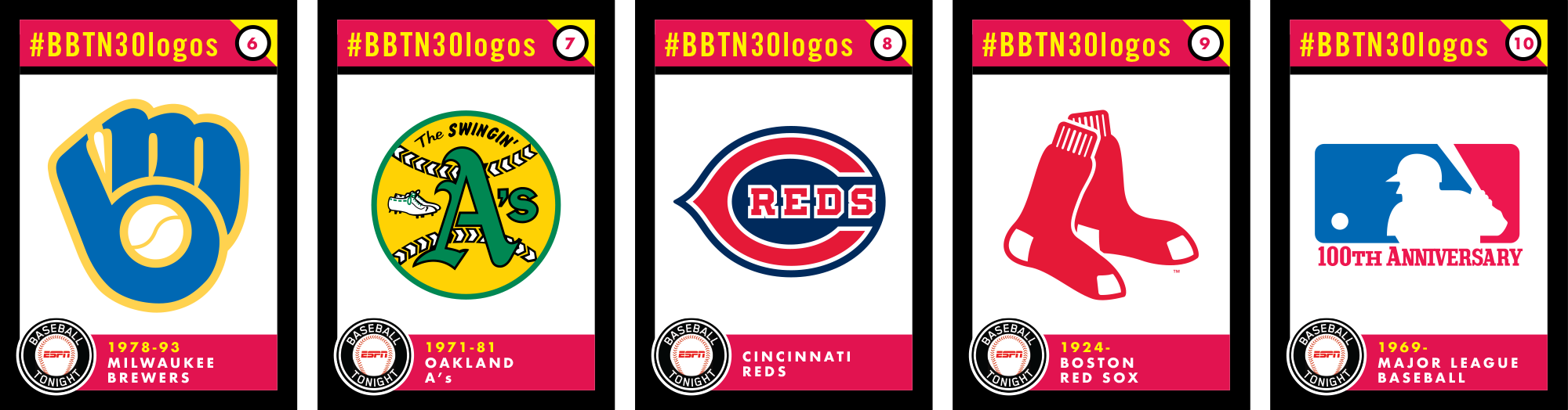
6) Milwaukee Brewers Ball in Glove primary logo 1978-93
Why does this merit a spot in our Top 30? It’s cerebral and iconic, it’s embraced by the locals with fervent affection, and it’s associated with the team’s only World Series appearance, back in 1982.
The logo was the winning result of a 1977 contest and was created by Tom Meindel, a student at the University of Wisconsin Eau Claire. His entry gave the club a contemporary look and helped usher in a new and exciting era era for Brewers baseball, one that represents the high water mark for the franchise to date. The logo was replaced in 1994 but never really went away. Today it’s arguably more popular than the Brewers’ regular look, one that’s been around since the year 2000.
7) Oakland A's primary logo 1971-81
Why does this merit a spot in our Top 30? Are you kidding me? Has there EVER been a logo that more perfectly fit a particular franchise? The gold and green colors, the white shoes, and the descriptor that identified the team as “The Swinging’ A’s” all contribute toward vaulting this logo into the inner Pantheon of all MLB logos.
The A’s won three consecutive World Series championships with this logo, the visual embodiment of Charlie Finley’s mustachioed band of winners. It also represents a time when team identities were less focus-tested than they are today, a spontaneously joyful trademark that represents a singularly weird and special moment in time.
8) Cincinnati Reds wishbone C logo
Why does this merit a spot in our Top 30? For one thing it’s got tradition on its side, having been around for more than a century, but it’s also a visual feast for the eyes, with the club nickname perfectly contained within the “C.”
The Big Red Machine of the 70s wore this logo, and it was just red and white, the model of powerful visual simplicity. The 1940 World Series champions wore this logo, and it contained a navy blue background. Today’s version features black as an accent color, but it’s still the same logo that connects so much of the history of this cornerstone franchise.
9) Boston Red Sox primary logo
Why does this merit a spot in our Top 30? For one thing it’s instantly identifiable, a logo that needs no words to explain what team it represents. It’s one of baseball’s most enduring marks, having been introduced in the early 1920s, and it seems to fit the franchise to a T.T.
The Red Sox, one of the game’s most tradition-minded clubs, have a time-honored logo, and it works exceptionally well for them.
Like most logos, it’s been tweaked over the years and was most recently streamlined ever so slightly back in 2009.
10) Major League Baseball silhouetted batter logo
Number 10 on our list of greatest MLB logos is one of the most familiar brand marks in the world. It’s featured three times on every team’s uniform, in every single game, from Spring Training straight through to the final out of the World Series, and has been the symbol of Major League Baseball for nearly a half century. It’s the MLB silhouetted batter logo.
Why does this merit a spot in our Top 30? Sheer brand impressions alone would cry out for its inclusion, but this beloved logo has much more than that to offer.
The logo was introduced in 1969 in conjunction with professional baseball’s centennial season. Created by artist Jerry Dior, the logo is a masterpiece of simplicity and elegance. It conveys the message of “baseball” with style and ease. It expands and reduces well, its red and blue colors can be readily swapped out with no loss of visual integrity, and it has aged gracefully since its introduction.
Contrary to popular opinion, the logo does not depict any specific player. Its red and blue colors were slightly tweaked 25 years ago; other than that it remains what it was when it was originally launched, the official symbol of baseball.
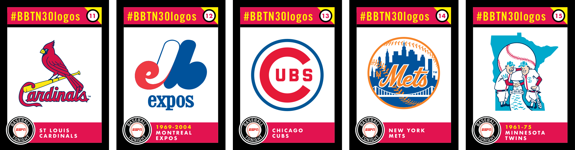
11) St Louis Cardinals primary logo
Why does this merit a spot in our Top 30? For starters, it’s got history on its side. The uniform version of the Cardinals’ "birds-on-bat" is widely respected, even by a handful of diehard Cubs fans. This logo features a single bird sitting atop the Cardinals’ beautiful script wordmark, an abbreviated and memorable representation of the team’s timeless and handsome identity.
The Cardinals’ birds have continually evolved since they were introduced in 1922, but they serve as the visual bond that connects all eleven World Series titles in franchise history.
12) Montreal Expos primary logo 1969-2004
Why does this merit a spot in our Top 30? It’s memorable, its got mystery attached to it, and it represents a modern approach to sports identity that helped define what the visual culture of sports looks like even today.
When the logo was introduced in 1969, the team described it as “a mod-shaped M for Montreal, encompassing an E for Expos, italicized for forward movement.” The logo represented the club throughout its entire tenure in Canada before passing into the great logo beyond when the Expos moved to Washington 12 years ago.
13) Chicago Cubs primary logo
Why does this merit a spot in our Top 30? It’s got staying power. The logo has evolved in multiple ways over the years, but it made its debut in 1909, the last time the club was defending a World Series championship.
While the current version features a very bold blue circle around the whole thing, my favorite iteration is the one that preceded it, which was used from 1957-1978. It was refined by the most influential designer in the history of baseball, Otis Shepard—a man who essentially created the look of Wrigley Field as we know it today. He designed the Wrigley scoreboard and helped design the bleachers. He created logos and uniforms for the Cubs, and he illustrated baseball’s most beautiful scorecard covers. He even sat on the Cubs Board of Directors for many years.
The Cubs’ logo is simple, timeless, and it communicates the team brand in effortless fashion.
14) New York Mets primary logo
Why does this merit a spot in our Top 30? For one thing, it’s the only primary logo the franchise has ever known, dating back to the Mets’ inaugural season in 1962.
The logo, created by sports cartoonist Ray Gotto, says baseball, it says New York, and it says “Mets”—which is a word that defies easy depiction. It’s an aesthetic masterwork, well balanced, perfectly proportioned, and readable at any size, instantly recognizable and timeless.
It does, however, lack one small detail that was included when it made its debut—a tiny interlocked “NY,” which used to be positioned to the left of the “M” in “Mets.” Beyond that, it connects all 56 seasons of franchise history from Marvelous Marv straight through to Thor. As Casey Stengel said, “you can look it up.”
15) Minnesota Twins Minnie and Paul logo
Why does this merit a spot in our Top 30? First of all, it’s got historic resonance, having literally made its debut on the day the franchise was designated as the "Twins," November 26, 1960.
It also has deep local significance, as it represents both Minneapolis and St Paul equally, in fun and stylish fashion, unified by the distinctive shape of the state of Minnesota, which is utilized as a background element. Minnie and Paul were created by illustrator Ray Barton, who was paid $15 for his artwork. His original version served the club through its first decade and a half in the Twin Cities before being tweaked, then totally abandoned.
Today Minnie and Paul loom large over Target Field, a reminder of the franchise’s origins and of the fact that the Twins were the first MLB club named for a state, as opposed to a single city.
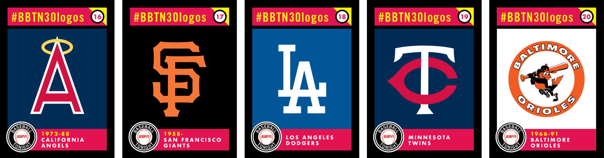
16) California Angels Halo-ed "A" logo 1972-88
Why does this merit a spot in our Top 30? Let's start with the fact that it represents the first link in a franchise chain that leads right up to today’s haloed “A,” amazingly now in its 16th season. The original upper case “A” echoed Anaheim Stadium’s 230-foot high “Big A” scoreboard, a stellar and memorable example of midcentury Southern California vernacular architecture. Like the scoreboard itself, this “A” is structurally sound, symmetrical, clean and contemporary, the perfect visual symbol for a then-young franchise seeking its own traditions.
This "A" served as witness to four Nolan Ryan no-hitters, as well as the franchise’s first postseason appearances. It was bulked up in 1989, was totally eliminated by the club in 1993; and was eventually given a thorough facelift and reintroduced just in time for the Angels’ lone World Series title in 2002.
17) San Francisco Giants headwear SF
Why does this merit a spot in our Top 30? It’s aesthetically flawless-every negative space is accounted for, it’s perfectly balanced—and it highlights the Giants’ orange and black color palette with elegance and ease. The spiky letterforms mesh with the team’s home uniform lettering in a harmonious way, helping create a distinctive visual brand.
The SF has evolved in subtle ways over the years—the current version is the fourth different version, and this one has been there for all three of the franchise’s West Coast World Series titles.
18) Los Angeles Dodgers headwear LA
Why does this merit a spot in our Top 30? It’s instantly recognizable, a symbol that spans six decades, connecting Koufax and Drysdale to Kershaw and Seager. The LA does a lot with a little—it only needs one color—white—and it contains no outlines or needless clutter. It’s both balanced and beautiful, and it accompanies the Dodgers’ iconic script uniform lettering in perfect fashion.
The LA is a very close relative of the Pacific Coast League’s Los Angeles Angels' LA logo, first used in the 40s and 50s, but, after five World Series titles the Dodgers own it lock, stock, and barrel.
It’s undergone a couple of very slight, almost imperceptible tweaks since it was introduced, but this is the Dodgers’ cap logo, just as it’s been for every single game since the franchise shifted west in 1958.
19) Minnesota Twins headwear TC
Why does this merit a spot in our Top 30? It’s historic significance is undeniable, a symbol from the franchise’s first days, when the new club couldn’t feature an “M” for “Minnesota” so as not slight St Paul. The "TC" stands for "Twin Cities," an MLB outlier. It’s got graphic chops too, wonderfully balanced, effortlessly classy, and readable.
The letters are connected, but the “C” stands out via smart use of color. The TC spans the entire Twins history, even though it was demoted to a sleeve patch just in time for the club’s first World Series title in 1987.
20) Baltimore Orioles primary logo 1966-91
Why does this merit a spot in our Top 30? It’s well-designed, nicely balanced, immediately recognizable, and it’s associated with the greatest players and teams in Orioles franchise history. The cartoon bird’s 1966 debut coincided with the O’s first World Series title. This bird is happy, he's up for a challenge and ready to take on the world, the perfect visual symbol for a franchise on the move.
It was created by an artist named Paul Carlson and Quartet Films, who also created the Jolly Green Giant, the Hamm’s Beer bear, and Tony the Tiger of cereal fame.
It’s replacement, the ornothologically-correct Oriole, seems cold by comparison—too detailed, too tight. This one works, and it’s linked with multiple winners and Hall of Famers.
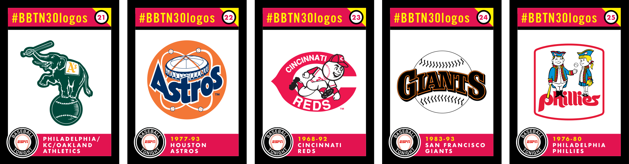
21) Philadelphia/Kansas City/Oakland Athletics elephant logo
Number 21 on our list of greatest MLB logos comes to us via a meandering path across the continent, from Philadelphia to Kansas City, and finally to Oakland, and it’s the Athletics’ time-honored elephant logo. Why does this merit a spot in our Top 30? It’s not an aesthetic masterpiece by any means, but it’s got history and tradition on its side. The Athletics, then based in Philadelphia, first utilized an elephant as their symbol in the franchise’s first years, a spirited comeback to an insult directed at them by New York Giants manager John McGraw. The elephant followed them to Kansas City in 1955, and, after several decades of disuse, was revived by Oakland in 1987, just in time for three straight World Series appearances.
It is now worn as a sleeve patch, a vestigial symbol that connects the franchise across three locations and nine World Series titles.
22) Houston Astros primary logo 1977-93
Number 22 on our list of greatest MLB logos comes to us from the Lone Star State, and it’s the Houston Astros’ 1977-93 primary logo, one which features the Astrodome, surrounded by a series of orbiting baseballs. Why does this merit a spot in our Top 30? It’s fun, it’s aesthetically balanced, and it calls out the Astros’ team name in bold fashion. It accompanies the club’s singularly iconic rainbow uniforms seamlessly, a dynamic duo for the technicolor era.
This is actually a revised version of the Astros’ original 1965 logo, bolder and less fussy than that first mark. Both are significant in that they depict the team’s home stadium, an MLB first.
23) Cincinnati Reds primary logo 1968-92
Number 23 on our list of greatest MLB logos comes to us via the birthplace of professional baseball, Cincinnati, and it’s the Cincinnati Reds’ 1968-92 “running man” logo. Why does this merit a spot in our Top 30? Well, for one thing, it’s associated with some of the greatest teams in the history of Major League Baseball, but it also contains an all-time classic mascot—not to mention the Reds’ iconic “wishbone C,” a Cincy staple since 1905.
Here’s an interesting piece of trivia as it relates to this logo—Mr Red’s uniform was changed to reflect the club’s adoption of pullover uniforms and beltless pants, so there are actually TWO subtle versions of this mark, the enduring symbol of the back-to-back Big Red Machine champions of 1975-76.
24) San Francisco Giants primary logo 1983-93
Number 24 on our list of greatest MLB logos comes to us from the City by the Bay, San Francisco, and it’s the Giants’ primary logo that was used from 1983-93. Why does this merit a spot in our Top 30? It’s a good looking logo, it literally says “Giants baseball,” but it also represents one of the best sports logos of its era. The lettering is rooted in tradition, but it isn’t overly retro. It strips away cliches, it’s clean and contemporary, and it really represents the club’s first exclusively San Francisco look for the club, something that wasn’t carried westward when the club left New York in 1958.
25) Philadelphia Phillies primary logo 1976-80
Number 25 on our list of greatest MLB logos comes to us from the disco era and the City of Brotherly Love—it’s the Philadelphia Phillies’ bicentennial look, which featured the characters Philadelphia Phil and Phyllis. This logo depicts the two mascots dressed up in colonial garb, including Phillies-branded tricorn hats. Why does this merit a spot in our Top 30? It’s fun, it harkens back to a time when mascots were a little less serious than they are today, and it likely includes the only representation of a human female form on any official MLB logo. There’s a certain amount of silliness embodied in this logo, but that’s OK when your team backs it up with Mike Schmidt, Pete Rose, Steve Carlton, Tug McGraw, and the franchise’s first ever World Series championship, in 1980.
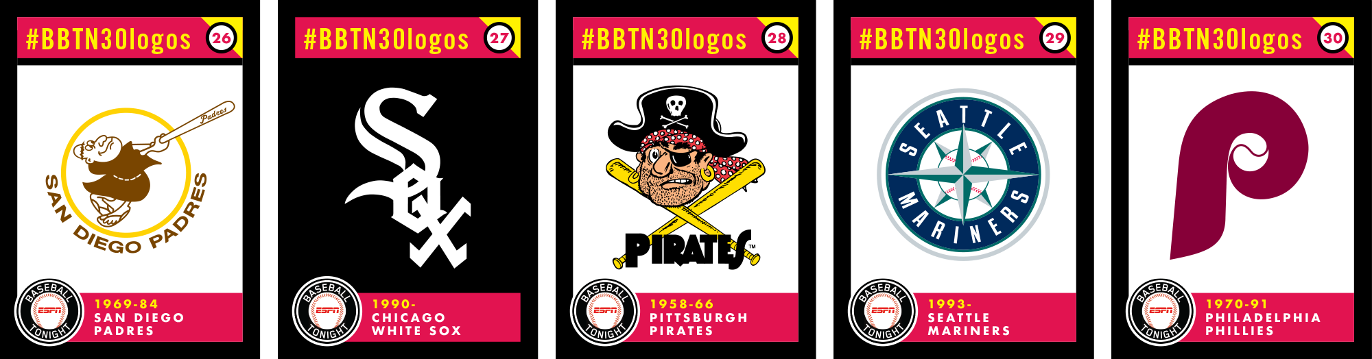
26) San Diego Padres primary logo 1969-84
Number 26 on our list of greatest MLB logos comes to us via America’s Finest City, SAN DIEGO, and it’s the Padres original Swinging’ Friar logo. Why does this merit a spot in our Top 30? The Friar’s origins predate the Major League version of the Padres, having originated in 1961 with the Pacific Coast League Padres, eight years before San Diego joined the National League
The Swinging Friar was created by San Diego native Carlos Hadaway, and it originally featured a Friar with a halo, which disappeared when San Diego went Big League in 1969.
Love it or hate it, the brown and gold color scheme associated with this look is unique to this franchise. It’s associated with the first generation of San Diego fan favorites from Nate Colbert and Dave Winfield, straight through to Tony Gwynn the 1984 NL champions-after which the logo was discontinued.
27) Chicago White Sox headwear logo 1990-
Number 27 on our list of greatest MLB logos comes to us from the South Side of Chicago-it’s the Chicago White Sox’ current cap logo. Why does this merit a spot in our Top 30? Those of us of a certain age can remember a time when the White Sox changed uniform and logo designs at a breakneck clip. Prior to establishing their current look, the White Sox ricocheted from identity to identity—some were hits, while others were misses. Change of this sort can result in brand confusion, a bad signal to send that can call into question the overall direction of a franchise.
This logo has been in use since 1990, and it’s done a fine job representing the White Sox since then. It’s distinctive, it does a lot with a little, and it instantly conveys the White Sox brand to even the most casual observer. It also harkens back to the popular White Sox teams of the late 50s and early 60s, so it has deep resonance for the South Siders' fan base.
28) Pittsburgh Pirates primary logo 1958-66
Number 28 on our list of greatest MLB logos is one that falls outside of the collective memory for many of us— it’s the cartoon pirate that was used by the Pittsburgh Pirates from 1958-1966. Why does this merit a spot in our Top 30? Some logos are great pieces of design, others are great illustrations—this is neither, but it IS fun and it is associated with the Buccos’ epic 1960 World Series victory. This stubbled pirate was drawn by longtime Pittsburgh Press artist Jack Berger, Sr, a throwback to a time when so many of our sports logos were charming and weren’t focus-tested into visual vanilla pudding. The Pirates have had plenty of memorable logos and uniforms over the years, this one clocks in in the number 28 spot in our 30 logos discussion.
29) Seattle Mariners primary logo 1993-
Our 29th greatest MLB logo comes to us via the mighty Pacific Northwest, and its the Seattle Mariners’ current primary logo, featuring their “compass rose.” Why does this merit a spot in our Top 30? This look was introduced in 1993, and its arrival coincided with what would soon become the greatest era in franchise history to date. This is a refined, clean visual identity, a modern classic, and it’s aged well in the quarter century that it’s been in use. The colors—navy blue, green, and silver—reflect the Mariners’ home region. Close your eyes, think of Ken Griffey Jr in his prime, then fast forward to Robinson Cano, King Felix, and the 2017 edition of the Mariners, and you have solid brand integrity, a timeless look that has stood the test of time.
30) Philadelphia Phillies 1970-91
Why does this merit a spot in our Top 30? This logo catapulted the Phillies into a modern era, out of Connie Mack Stadium and into the Vet, and it did so in classy fashion. Sleek, streamlined, and contemporary, this logo was paired with traditional pinstripes for a classic baseball look. A single color—variously maroon or a brighter red—it featured no outlines, no embellishment, and a modern take on what a baseball logo could look like. It bore witness to the first World Series title in Phillies history in 1980, and was worn by some of the club’s greatest all-time players.