Cincinnati, City of Logo Champions
Cincinnati is America’s Garden of Eden when it comes to professional sports, home to baseball’s legendary Red Stockings, who went pro in 1869. That team, literally named for its visual presentation, wore jerseys with a large red Old English “C” on the front. Various iterations of the Reds have come and gone since then, accompanied along the way by a series of pro football clubs that include the original Cincinnati Bengals, an outfit that played for a few seasons in the late 1930s and early 40s. Today’s NFL Bengals are well-established, having begun play in 1968. It’s also worth remembering the fact that Cincy hosted an NBA franchise for a decade and a half—the Royals, who now play as the Sacramento Kings—as well as a World Hockey Association entry, the Cincinnati Stingers, who played for four seasons, from 1975 until the league met its demise in 1979. When it comes to sports logos, the Queen City punches well above its weight, with a range of symbols that have looked both backward and forward for inspiration.
The Cincinnati Reds have largely embraced a “wishbone C” logo since the earliest years of the twentieth century, but when the team formally became “Redlegs” in 1953, they debuted a completely new symbol. (The renaming was an acknowledgement of the negative political connotations of “Reds,” whose association with communism was perceived to be a liability as the Cold War was sharply escalating.)
The character, which eventually became known as Mr. Redlegs, is credited to longtime Cincinnati Enquirer sports cartoonist Harold Russell (1888-1966,) an Ohio native whose illustrious career with the paper began in 1914. Russell enlisted in the US Army Tank Corps in World War I, returned home in time to cover the corrupt 1919 World Series (which resulted in Reds first World Series championship,) and drew his last cartoon for the Enquirer shortly before he passed away in February 1966.
Russell’s efforts coincided with the tenure of the Redlegs’ publicity director, Henry "Hank" Zureick, who was hired by the club in October 1951. Zureick, a former minor league pitcher and baseball coach at the University of Cincinnati, was himself a skilled, self-taught cartoonist, and he counted Russell as one of his mentors. Mr. Redlegs was unveiled prior to the 1953 campaign and was heavily leveraged that summer as Cincinnati hosted MLB’s All-Star Game.
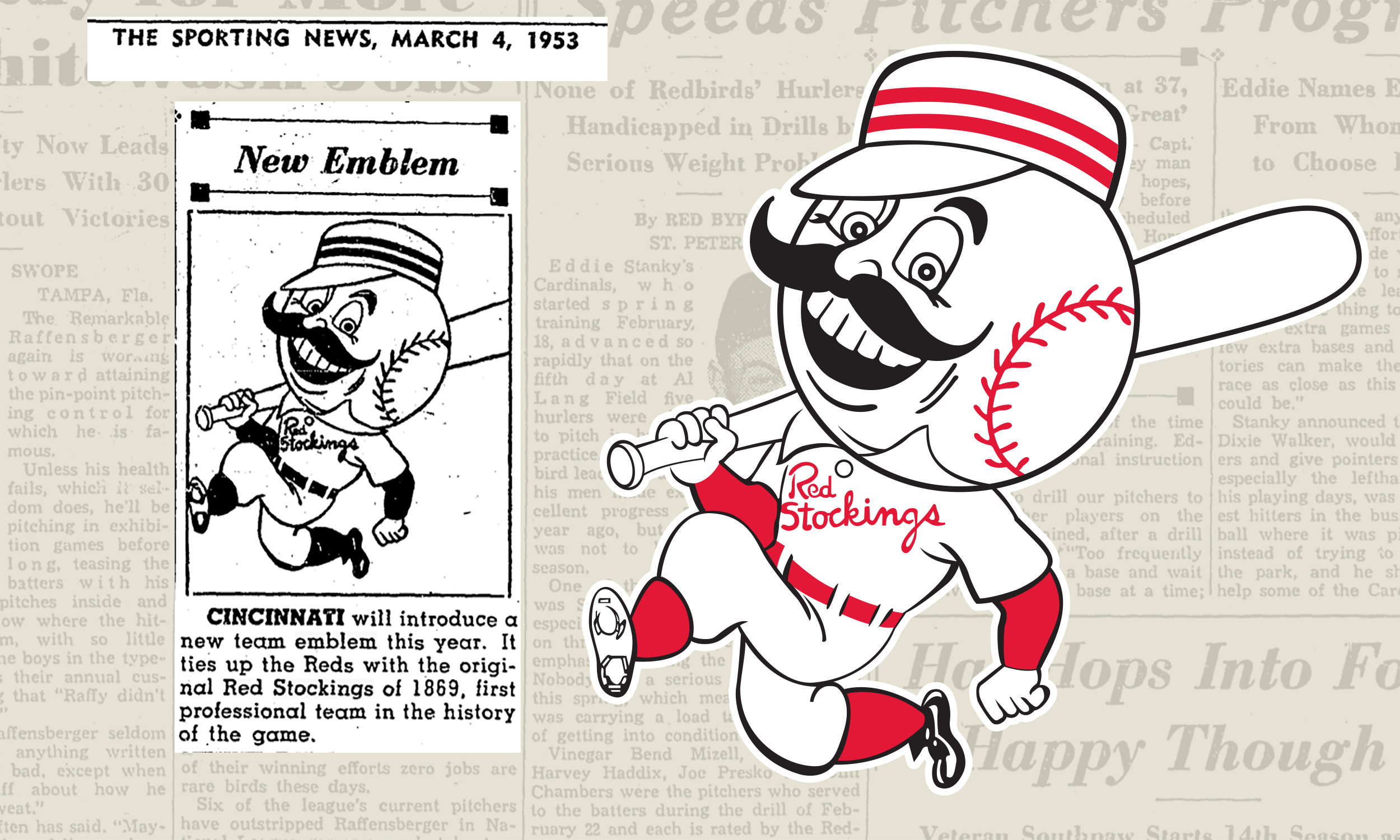
The club dropped the “Redlegs” designation in 1959 and a modernized version of Mr. Redlegs was introduced in 1967. Created by Jerry Burnett, an artist at Nolan, Keelor and Stites, a Cincinnati ad agency, the Reds’ “running man” logo is associated with the Big Red Machine dynasty as well as the Reds’ most recent championship club, the 1990 World Series winners.
Dick Wagner, the team’s business manager at the time of the change and later club president, explained the logo evolution in a 1974 Enquirer article, saying, “We were trying to develop a more up to date theme” as part of the franchise’s efforts to “improve our general presentation to the public.” Burnett shared his thoughts on the mark and sports logos in general, stating, “The average fan identifies with the square or cartoon-type things rather than the art school or design school approach.” Expanding upon this pragmatic theme, he added, “Artists don’t think they’re too modern, but the fans relate. Some of these things we consider corny. I don’t think that it’s bad, but it’s not an ultra modern design. They’re not going to hang at any art directors shows. They won’t win any awards.” In other words, pleasing the fans and selling stuff was Job One, even if it didn’t make for museum-worthy creations.

Mr. Redlegs and the NBA’s Cincinnati Royals share a father—Harold Russell. The Royals’ 1957 relocation from Rochester, NY, required a new club insignia, and Russell’s charming creation (who looks a bit like his baseball brethren) was unveiled in August 1957. The Royals replaced this mark in favor of something more sleek and contemporary in April 1971, just in time for the team’s final season in Cincy prior to their move to Kansas City less than a year later. This mark was the work of another Ohio native, Bob Grove. His crowned logo moved with the team to Kansas City, where they were renamed Kings, and to Sacramento, where they continued the franchise’s journey westward, in 1985. It was replaced in 1994 but served as the inspiration for the Kings’ current mark, which was introduced in 2016.
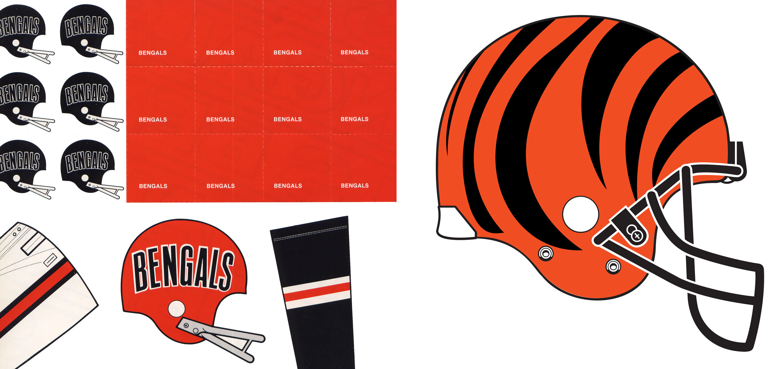
When the NFL’s Cincinnati Bengals introduced their first set of uniforms in April 1968, fans and media noted the fact that their helmets bore more than a passing resemblance to those worn by the Cleveland Browns. Both franchises were birthed by Ohio’s legendary football coach, Paul Brown, which doubtlessly helped to conflate the two visual identities.
The Bengals embarked upon a revolutionary new look in 1981, one that still serves as a unique hallmark for the team four decades later. The team’s polarizing striped helmets were designed by Bruce Claypool, at the direction of NFL Properties and its creative director, Dave Boss. The strikingly unique helmets took many observers by surprise, but Brown, ever the innovator, took a very close look at a striped helmet design when the team was formed before ultimately settling on an orange lid with the team nickname spelled out in condensed, sans serif letters. By the beginning of the 80s that design looked dated and fusty. Besides which, as Brown pointed out, “You can’t read ‘BENGALS’ at a distance.” He then enlisted the NFL’s help in developing a signature look, something that would instantly be identified with the Bengals.
The new striped helmets raised more than a few eyebrows. An anonymous NFL Properties employee told the media that the design was “not our favorite.” Brown’s son, Mike, who currently runs the team, expressed concerns about potential difficulties in fabricating the helmets and told the Associated Press, “I tend to be a little more conservative than he is.” NFL Properties president Bob Carey was dubious about the long term viability of the design, noting, “(U)nless they go all the way, the stripes won’t have any lasting fame. They need to win the Super Bowl a few years in a row and become a national team like the Dallas Cowboys or the Pittsburgh Steelers.” Let the record show that he was wrong.
The 1981 Bengals broke through in a big way, running up a 12-4 regular season record and advancing to the Super Bowl for the first time in franchise history. Claypool, in comments to the Columbus (Indiana) Republic in January 1982, just ahead of Super Bowl XVI, made no apologies for his work. “If you don’t like it, that’s tough,” he said. “Everybody’s got their own individual taste, The Bengals were looking for a new and unique look and I think they got it.” And so they did.
Finally, let’s take well-deserved look at Cincinnati’s World Hockey Association club, the Stingers. The team and the league did not endure, but the Stingers’ logo—designed to meet the needs of an expansion club in contemporary fashion—still looks fresh more than four decades after the team folded.
The logo was created by William Sontag (1932-2010,) a Cincinnati-based designer who previously worked at New York’s prestigious Chermayeff Geismar firm on accounts for a range of big corporate clients, including Pan Am and Xerox. The aforementioned 1974 Enquirer article describes the Stingers’ logo, which was completed in June of that year. It notes that Sontag, working under the “careful scrutiny” the team’s executive VP, William O. DeWitt, Jr. (currently the principal owner and managing partner of MLB’s St. Louis Cardinals,) went through some 50 variations over the course of a six week process. DeWitt, Sontag explained, did not want a cartoon character or a traditional look. “He wanted something with more flair. He wanted the bumblebee, the colors black and yellow and something that would work on uniforms, stationary, glasses, even ties.”
“Most professional teams now seem to want a device of some kind, something jazzy, something totally different,” added Sontag, observing that modern trademarks left fans with an immediate and favorable impression, an important factor in an era when a glut of expansion teams and new leagues were coming and going.
Cincinnati was one of the ten largest US cities in the late nineteen century. Today it ranks somewhere in the mid sixties, behind places like Corpus Christi, Texas and Riverside, California. Regardless of population, Cincinnati’s place in the Pantheon of American sports logos is both interesting and secure, more than a century and a half after its first pro team, the Red Stockings, took the field of play with a large Old English “C” on the fronts of their uniforms.