Modern But Timeless Sports Logos of the 60s and 70s
The late 1960s and early 1970s represent a time of rapid societal change, both here in America and all over the world. It was at this time that new means of communication and technology gave rise to a golden era of corporate branding, characterized by an aesthetic sensibility which served as the perfect visual expression to connect with consumers of the space age.
As complex logos gave way to sleek, bold, streamlined trademarks, whimsical logos were replaced by forward-looking identities in which shapes were synthesized into minimal elements that could capture a consumer's attention in milliseconds.
Paul Rand—arguably the most influential logo designer of any era—summed up the ideology behind this movement with these rather unsentimental words:
"The principal role of a logo is to identify, and simplicity is its means…its effectiveness depends on distinctiveness, visibility, adaptability, memorability, universality, and timelessness."
The modern look was propelled forth by the Swiss Style of design, which featured exceptionally clean aesthetics and an emphasis on readability and a distinct lack of embellishment.
The world of sports identity was inevitably influenced by these larger, global trends. Some of the logos that were created at this time are remarkable in their starkness and simplicity.
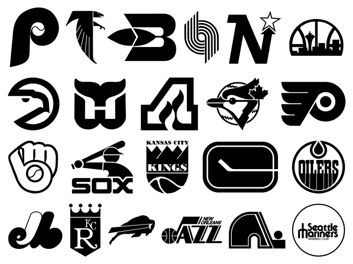
Frank Glickman's 1970 Portland Trail Blazers logo could well be that of a bank. The Atlanta Hawks and Flames logos—created simultaneously by designer Bob Wages of McDonald & Little—are spare and powerful and remarkably timeless. The Philadelphia Flyers, Buffalo Bills, and Minnesota North Stars identities denote movement and strength, all with minimal graphic effort.
The Flyers and Edmonton Oilers have both continually employed their logos since they were originally conceived, albeit with slight tweaks along the way. Many of these logos have been significantly evolved since they were created. Some were abandoned outright, others were left behind and picked up again years later and designated as secondary or alternate logos.
Visual trends come and go—trends are, after all, trends. But the power and visual honesty embodied by many of these identities endure. It's worth noting that all of these originated in the pre-digital age. In spite of the boldness there is charm within all, the faint trace of a human hand, and a sense of optimism. Lots of sports identity today is inspired by the past, these focus squarely on the future. Paradoxically, many of the above teams have long ceased to exist—but the Montréal Expos, Hartford Whalers, Buffalo Braves, Minnesota North Stars, and others all live on via their logos.