Sports Logo Case Study #9—the Lost Uniform Years of the New York Rangers
The ninth in an ongoing series of entries about vintage sports identities. Sports fans, as I have often said, are the most ardent brand loyalists on the face of the earth. There are stories to be told here at the intersection of art, commerce, history, and fandom.
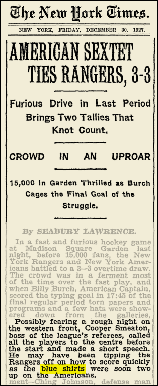
The New York Rangers are in the Stanley Cup finals for the first time in 20 years. The Rangers' on-ice identity has been steady and consistent since they first laced up their skates in 1926. Inspired by the color of the team's sweaters, the Rangers have long been known as the "Broadway Blueshirts—" this reference from the New York Times dates back to their second season, 1927:

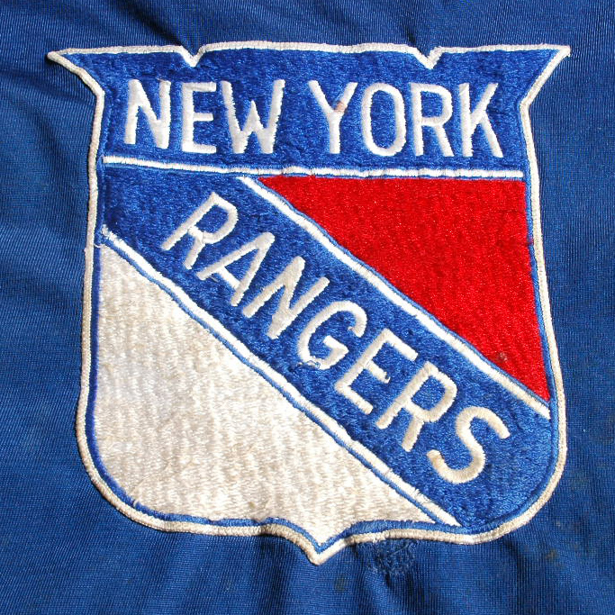
The Rangers have worn their iconic uniforms featuring a diagonal representation of the word "Rangers" since their very first game on November 16, 1926. There have been but three seasons where they broke away from this look. In 1946-47 the Rangers became the first team to to regularly televise their home games. In a move seemingly designed to coincide with this, the team wore uniforms featuring an arched "Rangers" over player number. These lasted but a single season. And, in 1976, the Rangers streamlined their look in a big way, placing their primary shield logo front and center for the first time in team history.
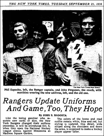
New General Manager John Ferguson instituted the change, saying that "we want to project a new image…those wider stripes make an athlete look taller." Indeed, the uniform striping was radically modernized, a total and clean break from a half century of tradition.
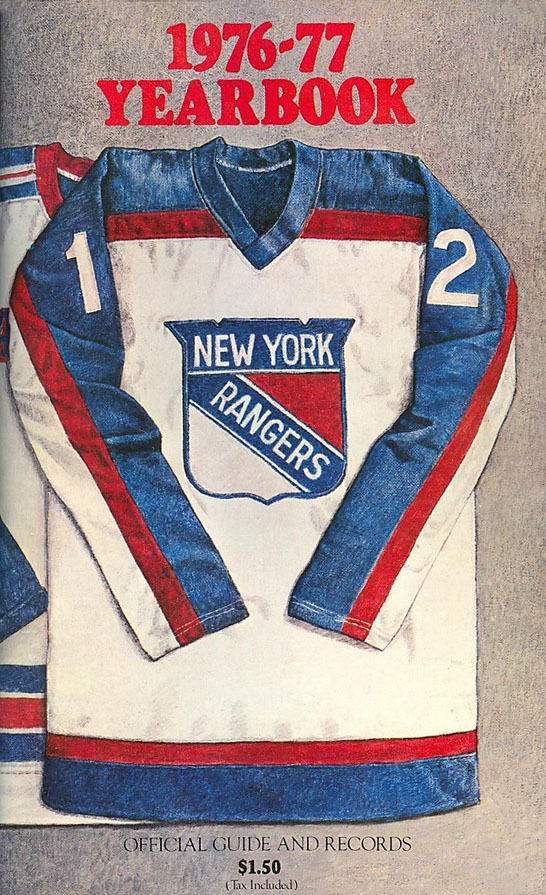
Success or failure for a new team aesthetic is often dictated by the success or failure of the team itself. The 1976-77 New York Rangers missed the playoffs. Though the 1977-78 squad made the postseason, Ferguson was fired. The shield jerseys were directly associated with him and were widely disliked by the fans. Thus it came as no surprise when, in July 1978, new team GM Fred Shero announced that he was scrapping the look instituted by his predecessor. Aging superstar Rod Gilbert, the team's all-time leading scorer, was instrumental in convincing the team to return to the traditional look. The popular Gilbert was effectively forced into retirement by Ferguson in late November of 1977.
The New York Times stated in a July 18, 1978 article that "Gilbert contended that Ferguson's uniforms had the team crest on the chest, and that made it uncomfortable for the Rangers to move their arms." A singular example of revenge by uniform change.
Shero touted Ranger tradition at his introductory press conference, and no visual symbol was more associated with Ranger tradition then their traditional sweaters. Back they came, and they have remained there ever since, albeit with slight tweaks and the addition of a third jersey for a decade, starting in 1996.
John Ferguson went on to run the Winnipeg Jets as they entered the National Hockey League in 1979–80. He instituted uniform change there too, nearly replicating the Rangers style that he implemented a couple of seasons earlier.
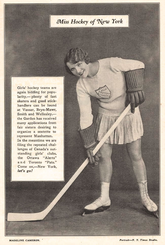
While researching this post, I came across an image from a Rangers game program from their second season, 1927–28. Miss Madeline Cameron, onetime Ziegfeld Girl, Miss Hockey of New York, is wearing a very early version of the team's shield crest. Yes, she is wearing a skirt, and no, there is no bold red and blue striping, but this sure looks like a prototype of what the Rangers wore a half-century later.