Reimagining the Mets Logo for the 21st Century
The New York Mets' time-honored skyline logo was created in 1961 and has been utilized by the franchise—with a few tweaks—ever since then.
The visual landscape of New York has evolved over the past half century, the result of both development and of tragedy. Most recently, the city's booming economy has given birth to a transformed skyline, happening even as I write this.
According to Wikipedia:
Since 2003, New York City has seen the completion of 23 buildings that rise at least 600 feet (183 m) in height. Thirteen more are under construction, including One World Trade Center, which will be the tallest building in the country when complete. One World Trade Center is part of the redevelopment of the World Trade Center, which also includes the 975-foot (297 m) 4 World Trade Center, 7 World Trade Center and the two under-construction buildings: the 1,350-foot (411 m) 2 World Trade Center and the 1,171-foot (357 m) 3 World Trade Center.
Overall, as of July 2014, there were 258 high-rise buildings under construction or proposed for construction in New York City.
Several weeks ago I noticed the looming One57 building going up—from a good ten miles away. This got me thinking—what if the Mets' skyline logo was redesigned for the 21st century?
The original logo dismisses both relative scale and location of specific buildings, so ours will as well.
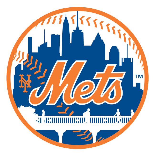
And, just because I could, I have restored the small "NY" to its rightful place (it was eliminated in 1999.)
