2013 World Series Edition—B Is For Boston
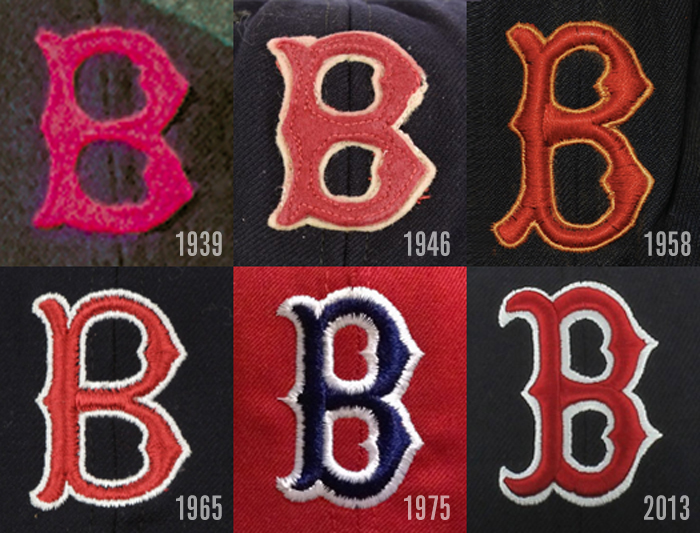
The Red Sox' cap "B" logo has represented both the city of Boston and the club for more than 75 years.
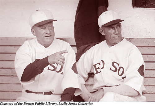
The Red Sox' headwear was spartan-looking during the first few decades of the franchise's existence, featuring either horizontal or vertical stripes, or no decoration at all. The first visual representation of anything on the team's cap came in 1931—a single red sock. This lasted for but one season.

The club reverted back to nothingness on their lids in 1932.
The 1933-35 teams utilized a red block "B."

Finally, in 1936, the Red Sox settled upon a visual icon that they have continued to use, right up to the present time.
The "B" has evolved over the years. A white outline was added in 1946. The base color of the caps was changed from navy blue to red in the mid 70s, then back to the traditional navy blue in 1979. The team reverted back to white caps for the first time in 60 years for an April 13, 1997 game against Seattle at Fenway Park. This time the"B" was red, outlined in navy.
The headwear "B" migrated to the team's jerseys for the first time in April 2013, following the tragic Boston Marathon bombing, in the form of a sleeve patch. Interestingly, the patch was also worn by the Kansas City Royals (on April 20, 2013) and San Francisco Giants (on August 19, 2013)—likely the first time in MLB history that a component of a single team's visual identity was worn on the uniforms of three different clubs in a single season.
The team has also sported an alternate cap that features the primary logo "hanging sox" on several occasions since 2009, although it hasn't been worn in some time.
As the Red Sox participate in the franchise's 12th World Series, the "B" is perhaps more visible than at any time in its long history.